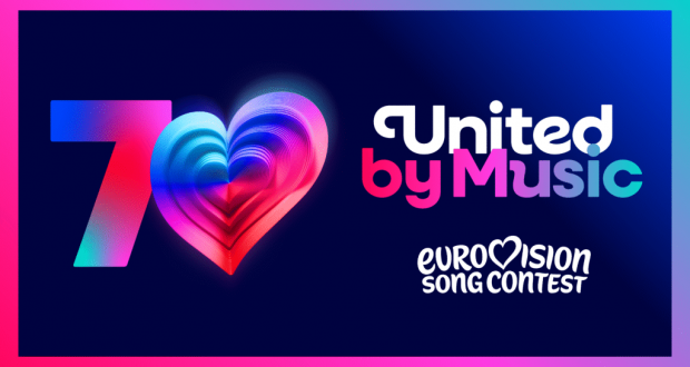
The Eurovision Song Contest is entering a new era with a refreshed visual identity. The European Broadcasting Union (EBU) has unveiled the competition’s new general logo, which will be used from now on, starting with the 70th edition of the Contest in Austria in 2026.
This redesign marks a significant milestone – 70 years of the world’s largest live music event.
For the first time in the contest’s history, the general logo was created in collaboration with the British studio PALS, which was previously involved in creating the visual concept for Eurovision 2023 in Liverpool.
![]()
The heart that beats stronger than ever
The new logo is a simplified, yet refined, version of the original 2004 logo, which was first updated in 2015. At its core is still the recognizable heart, which now beats louder than ever. The heart has been nicknamed the „Chameleon Heart“ because it is dynamic and can adapt to different themes, reflecting the host country’s identity, a performer’s individuality, or a specific theme. To celebrate the 70th anniversary, the heart is made up of 70 layers, each symbolizing one year of Eurovision.
Another important change is the emphasis on the words „Song Contest.“ The previous logo placed emphasis on the word „Eurovision,“ whereas the new logo’s font is uniform, making the brand more clearly defined as the „Eurovision Song Contest.“
A new visual identity for the digital age
The new logo, along with the new font „Singing Sans,“ will be used on all promotional materials and social media. After the main contest, it is expected to be applied to sister competitions such as the Junior Eurovision Song Contest.
The Director of the Eurovision Song Contest, Martin Green, commented on the redesign:
“The Eurovision Song Contest has always been about evolution – musical, cultural, and creative. This refresh honours 70 amazing years while taking the brand forward to an exciting future. It’s bold, playful, and full of heart – just like the Contest itself.
We’re so proud to unveil it to the world. Our new logo and look have been designed to make the Eurovision Song Contest brand clearer on digital platforms, bring our family of projects all into one space, and protect the brand globally for EBU Members as the Contest continues to attract new audiences across the world.
You’ll start to see more of our new brand identity as we head towards next year’s Eurovision Song Contest and there’ll be more surprises, and details on all the activities celebrating 70 years of being United by Music, coming in the months ahead.”
Tour for the Finalists?
Although the new visual identity is the main topic, the head of the Lithuanian delegation hinted at another novelty earlier. Namely, ten finalists could get the opportunity to go on a tour of European arenas after the competition, although the exact locations are not yet known.
Furthermore, earlier reports also mention the possibility of changing the trophy’s design due to issues with it breaking during transport and on stage itself.
What do you think about Eurovision’s new visual identity? Do you prefer the old or the new version?